As Far As The Eye Can See: Colorful Sceneries, Posters And Covers
With the lovely weather we’ve been having here in Belgium, all of my senses actively engage when I’m riding my bike. I find myself picking up colorful sceneries while the smell of fragrant flowers and the birds’ singing somehow doesn’t manage to escape me. Oh yes, it’s Summer alright!
Not sure about you, but this is the period when I usually feel most inspired, probably, because I’m spending way more time outside. After all, nature is where I find most of my inspiration as it sets my mind free and I feel at ease. Hopefully, you’re enjoying some sunny days, too. Give yourself a moment of repose. Sit back, relax, have a refreshing drink and let the stream of inspiration come in.
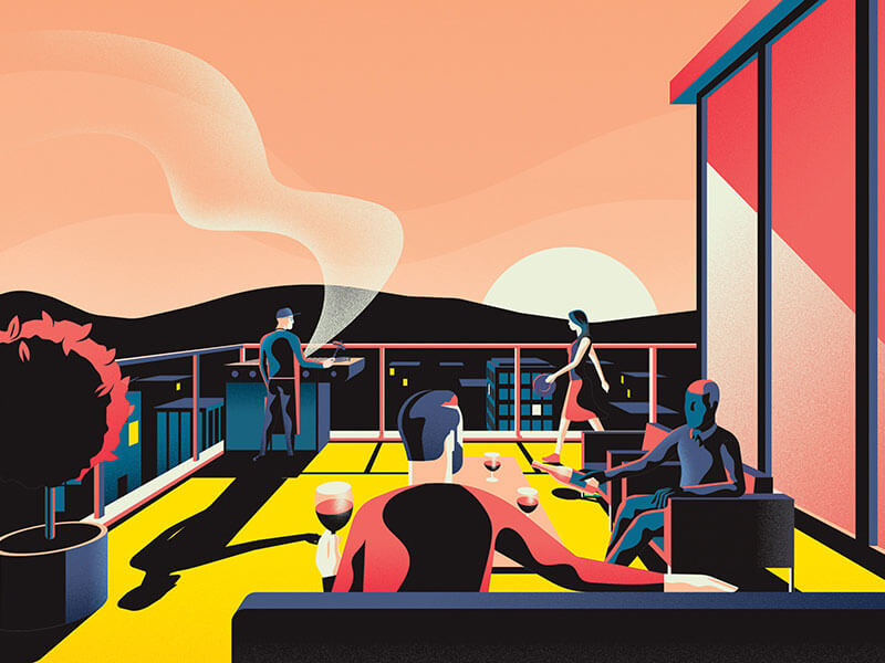
Unparalleled Living
I love how the characters are dialed down to just the basics.
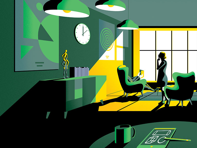
Curated Living
Here’s another one from the same series. The designer chairs and little statue on the closet are a nice touch.
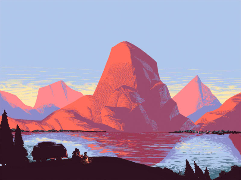
#VanLife
I think that the adventurous souls will love this one. The sunset light effect is so well done.
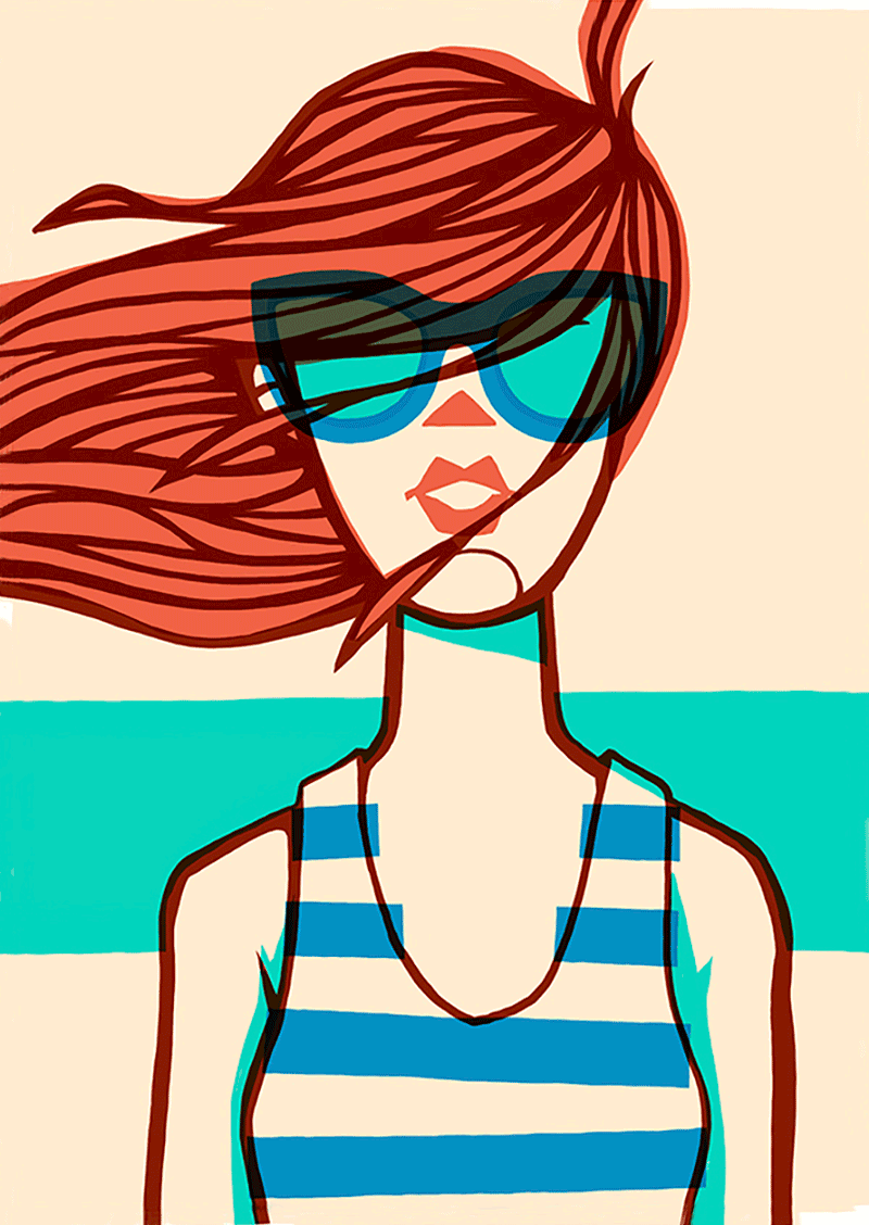
Your Friends Are Cooler Than Me
Great and inspiring use of line and overlaid blocks of color.
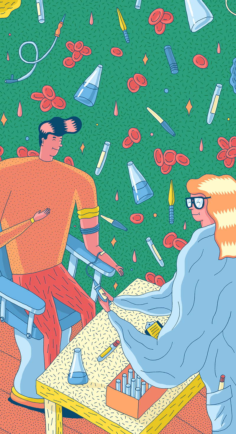
Regina Maria
Part of a series of seven colorful illustrations depicting scientific processes and equipments, micro organisms, bacteria, and lots of fun stuff, which brings a warm human touch to the labs. Also making them the most visually attractive lab in Romania.
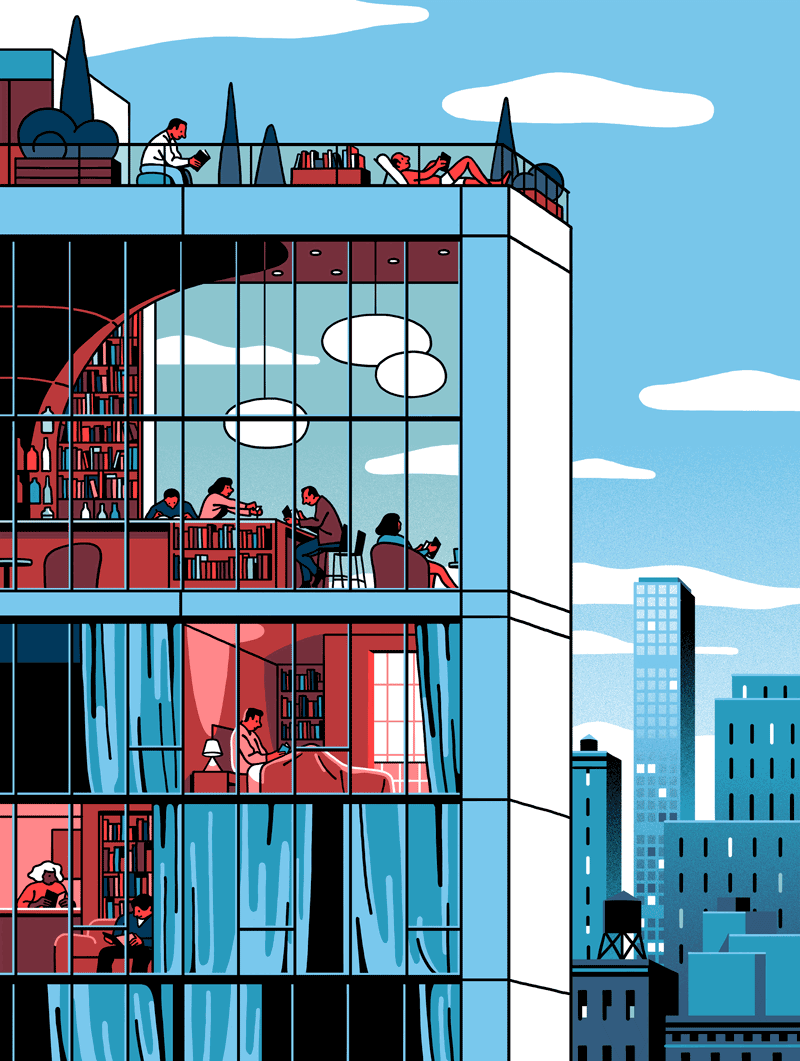
Omega Magazine — Library Hotels
I love the style of Vincent Mahé. Fine work with a limited amount of colors used.
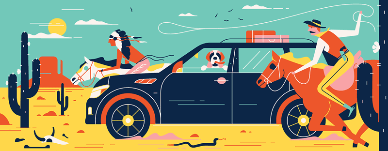
GQ France: Infinity QX 80 Luxury Limited Edition
A bit of humor in an illustration always works for me. Nice lines and the way the colors are applied.
Àrea Metropolitana De Barcelona
Wonderful collage of activities and sights in Barcelona.
Ikea ‘Light’ Animations
Diggin’ that style! Brilliant colors and textures. This is so well done.
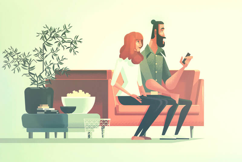
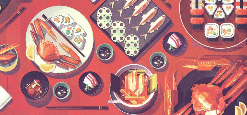
Japanese Food
Great illustrative visual of Japanese food. So many little details in there.
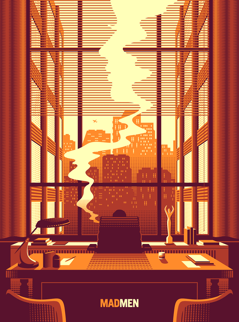
405 Madison Ave
Daring background color in this three-colored screen print poster. The patterns are very cleverly done.
I’ve Got My Eye On You
Beautiful close-up capture of an owl. Look at those eyes!
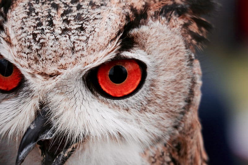
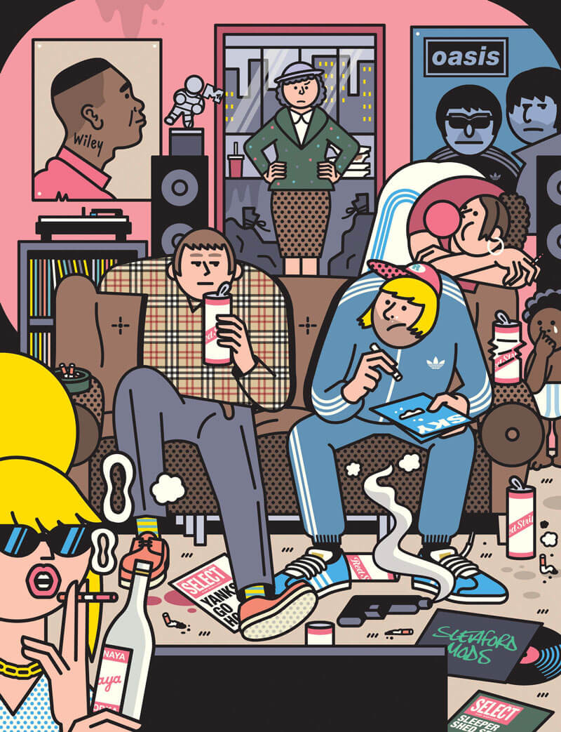
Image Magazine
Amazing scene! Love the Oasis poster and the patterns on the shirt.
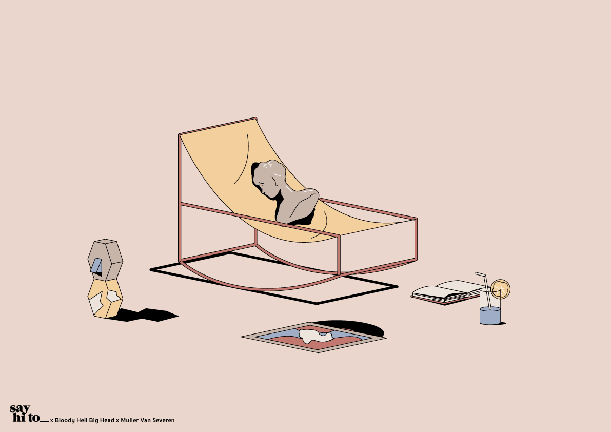
Say Hi To_ Tanawat Sakdawisarak x Muller Van Severen
When I first saw the furniture of Muller van Severen I was impressed by the combination of the lines and geometric forms. Great to see their furniture pop-up in these Illustrations. Be sure to check out the rest.
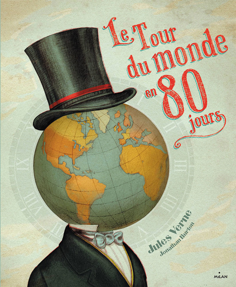
Le Tour Du Monde En 80 Jours
Lovely book cover and I particularly love the textures used.
ABD Digital Reflection
Illustration for the Dutch Senior Civil Service on how necessary it is for civil servants to reflect on the digitalization of society. Here the textures are the leading stars.

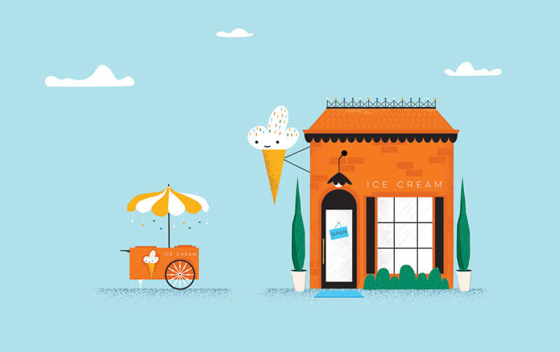
Ice Cream: Andrew
I don’t know about you but I hope Summer will deliver so we can enjoy many of these. Beautiful colors and very cute style.
De Correspondent
Editorial illustration for the online Dutch news platform De Correspondent. Love the fun representation of going a little bit overboard during the workout.

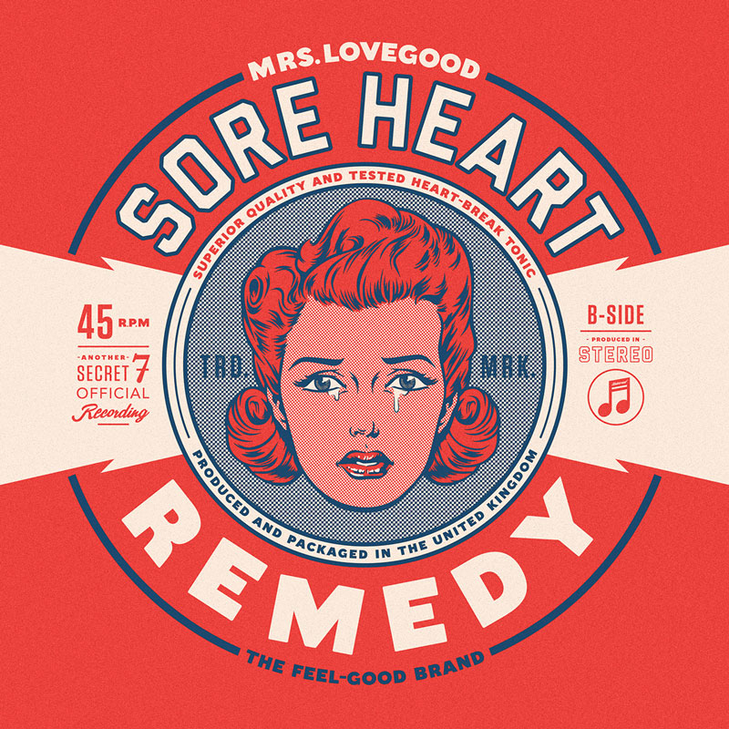
Secret7” Exhibition
Fantastic vibe in this vintage looking 7” record sleeve.
Cyrus Magazine
Interesting insight into the imagination on how to translate a woman who has built a highly successful business offering online advice, but has now sold most of the company to her employees.
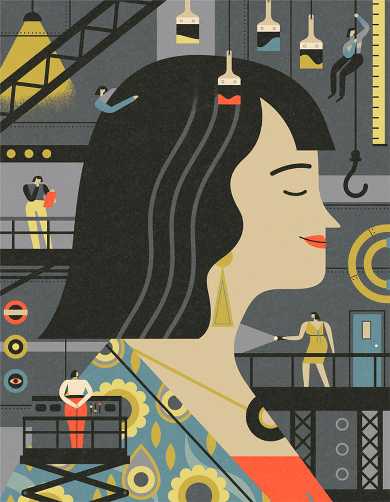
Serviced Living
Interesting color choices. Digging the little furniture decorations. These strong curved lines, and the recurring yellow and black for the light and shadow make this a very recognizable design style.
Hot Luck Live Food & Music
Nice logotype. That red is pop’n.
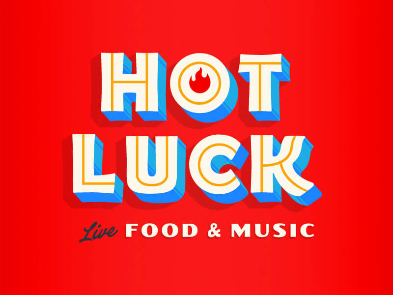
The Giro And The Dolomites
My friend Jered Gruber always captures the most amazing moments on the bicycle.
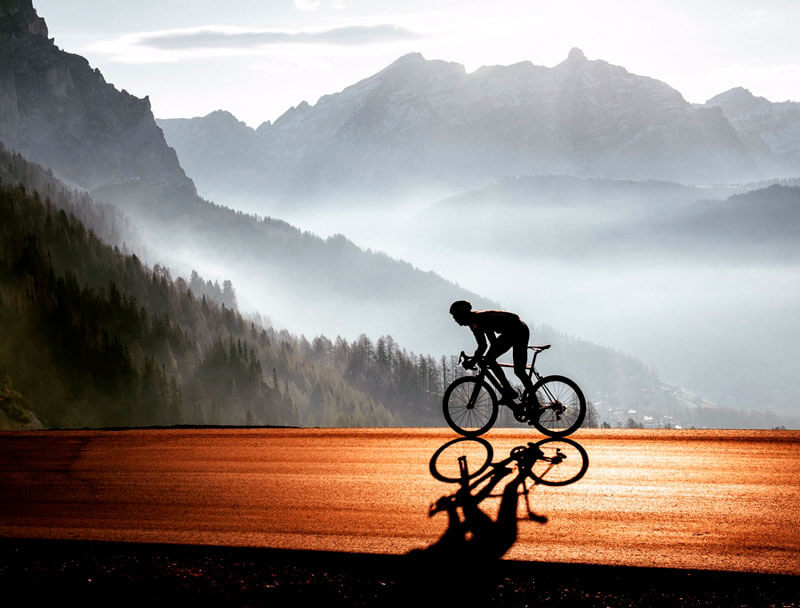
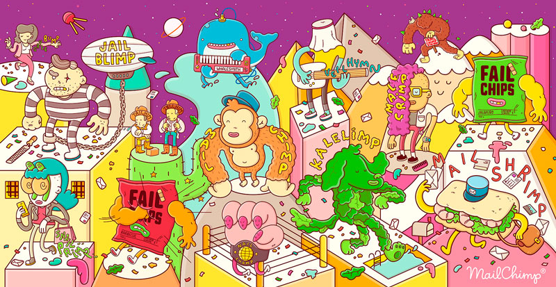
Inception Mural
Another fantastic piece of work from the Spanish brothers. A mural created for MailChimp.
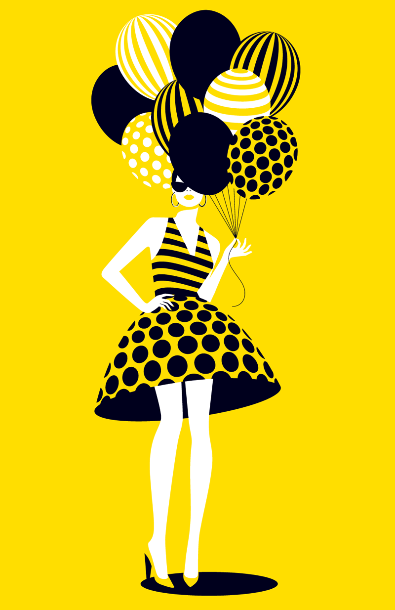
Balloons: Papyrus
Magnifique! Greeting card illustration for Papyrus. That dress is genius, and I love her elegant pose. Just perfect!
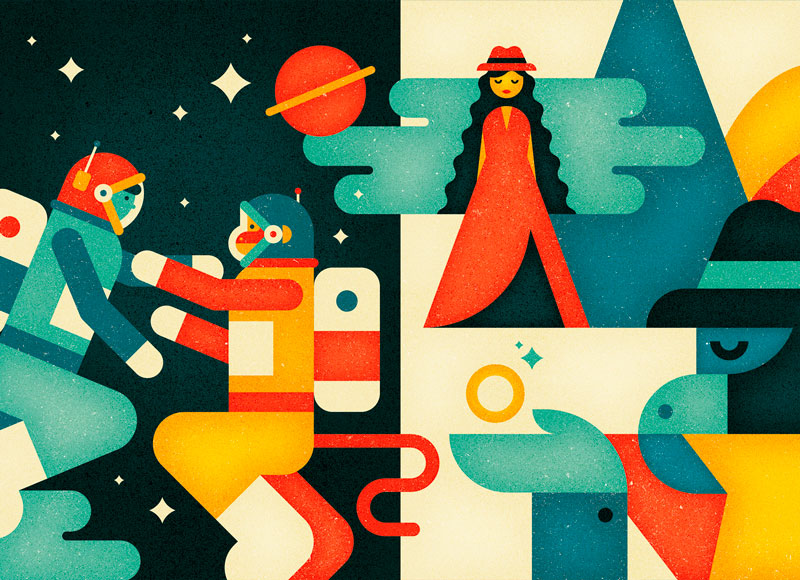
Drawing Rama / Hanuman’s Story
Great color palette.
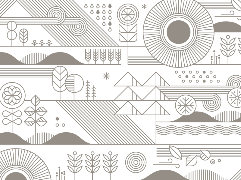
Target Wallpaper
Love the minutia of this. I love the wind in the upper left. I have this obsession of artwork that uses simple patterns and pure geometrical shapes well, so this one really appealed to me.
Pleasant Thoughts
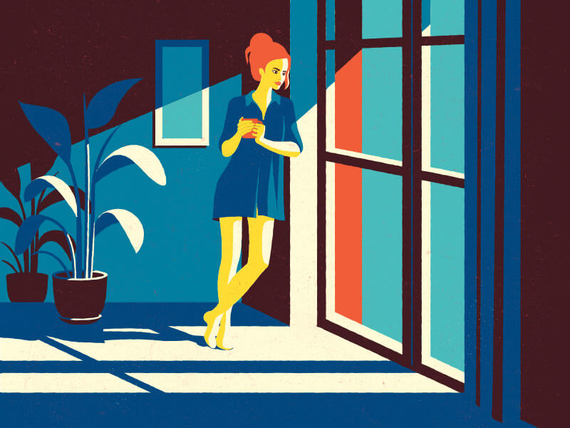
Composition, long shadows to reflect pure strong sunlight, plus some special colors — all wonderfully done.
London Stuff
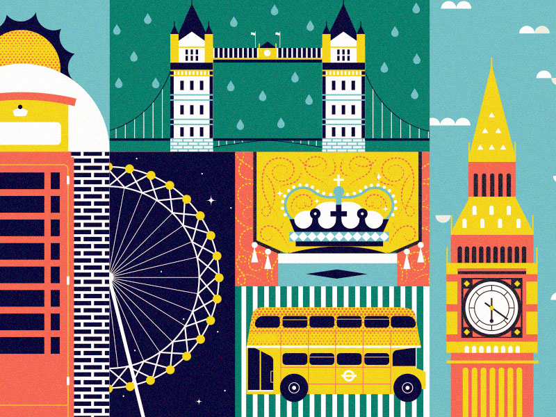
Nice collection of London elements.
Blockhaus
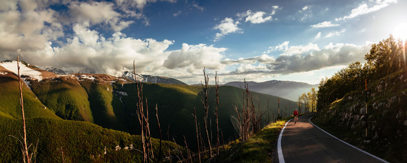
Everything you wanted to know about the Italian climb called ‘Blockhaus’. Beautiful light and perfectly timed.
Beauty Of Birds
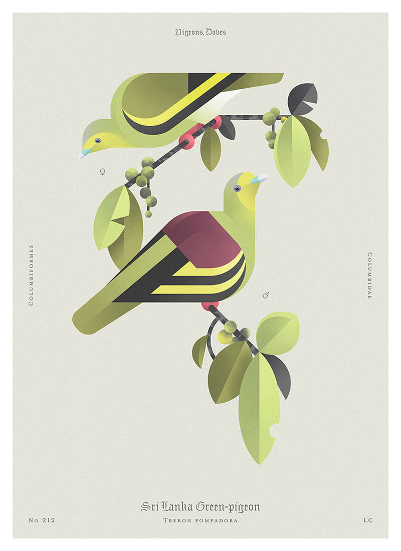
Lovely clean illustration style. Beautiful tones.
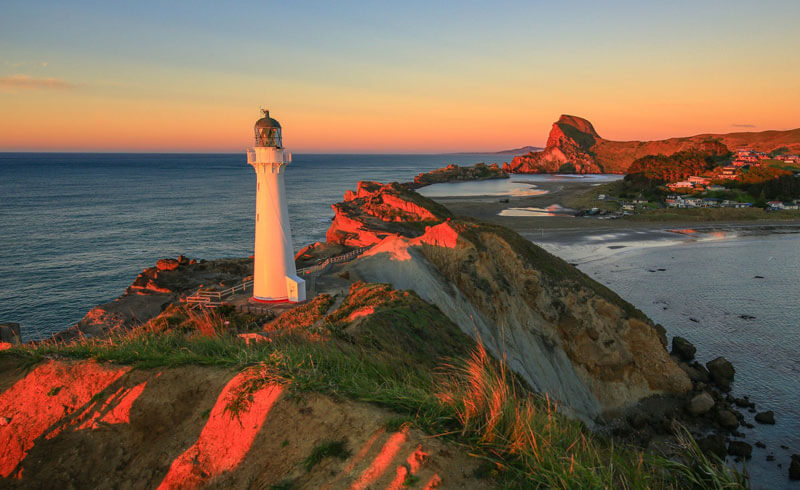
Castle Point Red Dawn
Dawn breaks over Castle Point lighthouse in New Zealand with the warm red colors of Autumn.
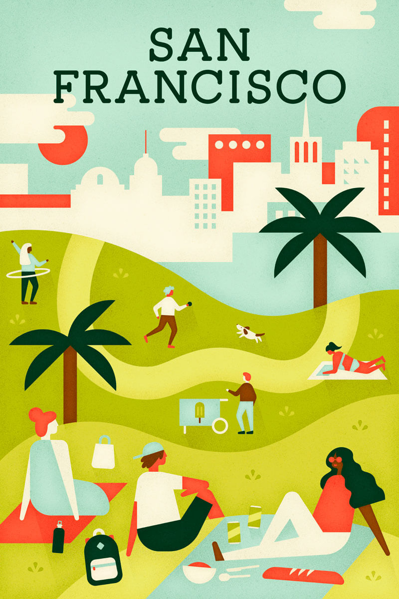
San Francisco City Poster For Airbnb Experiences
Color palette and textures are very much on point in this poster for Airbnb.
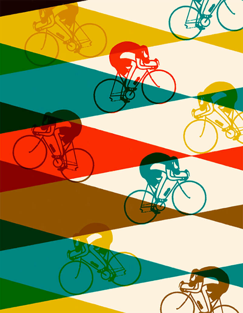
The Ride Journal
Great work with overlaying colors.
Walkmania
The whole arrangement is really awesome with some special colors.

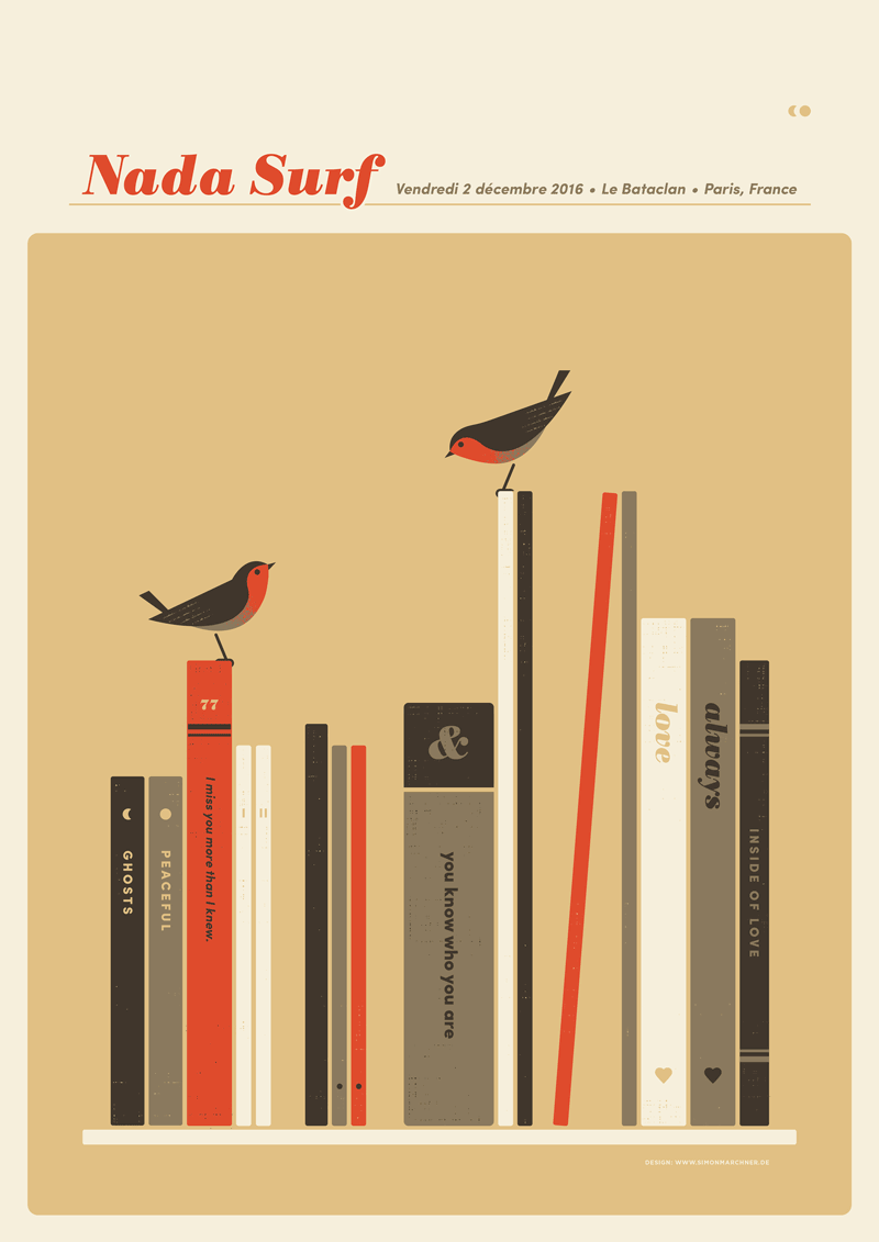
Nada Surf Paris
Great simplicity as well as in style and color.
Secret Portraits
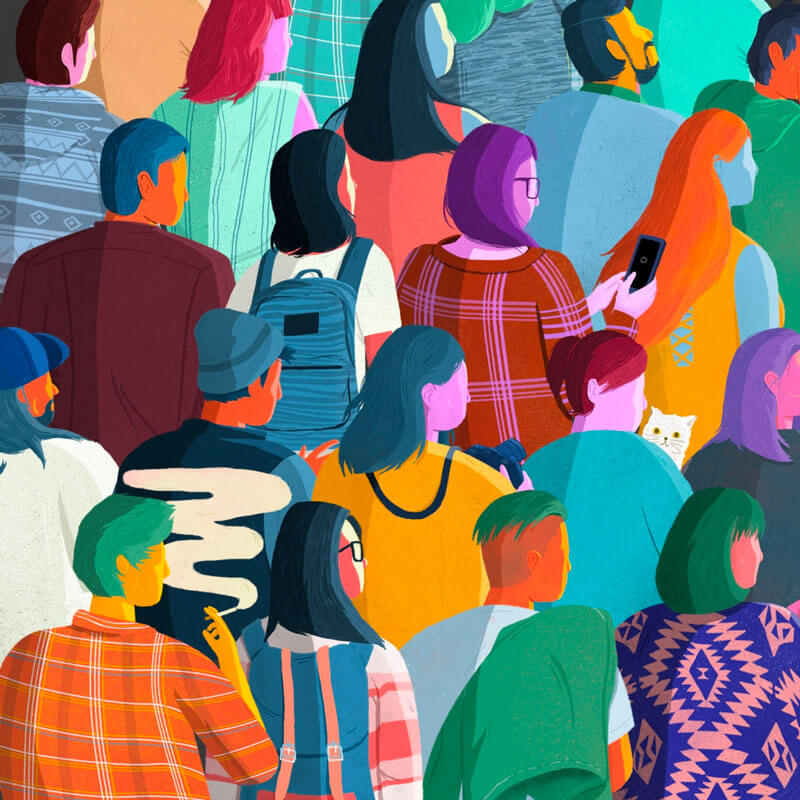
Interesting combination of many different colors. Some not so obvious. I also love the patterns in some of the clothes.
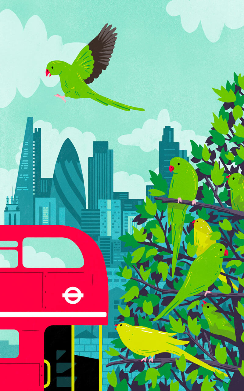
Sounds Of The City
This poster focused on the pandemonium of parakeets that can be found around London adorning trees in otherwise quiet parks. Love the very bright red and green combo.
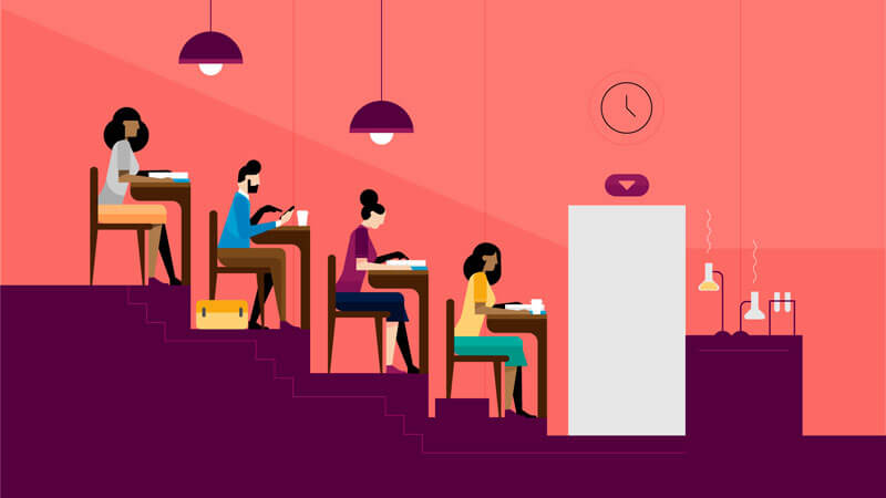
Untold Story
A nice collection of colors. Also digging the composition and simplicity of the characters in the scene.
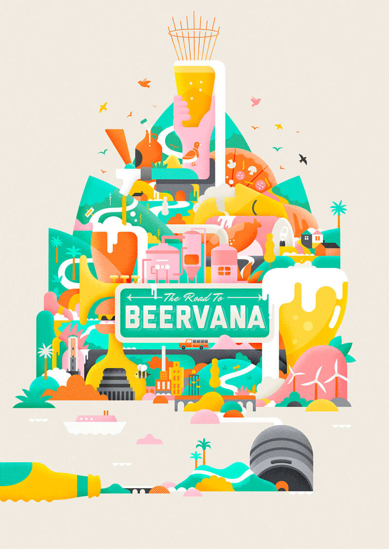
Beervana
Colorful scene about beer. The title made me smile.
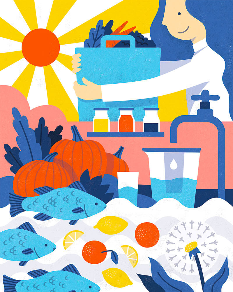
Liver Lovers
Beautiful composition. Love the little details on the fish.
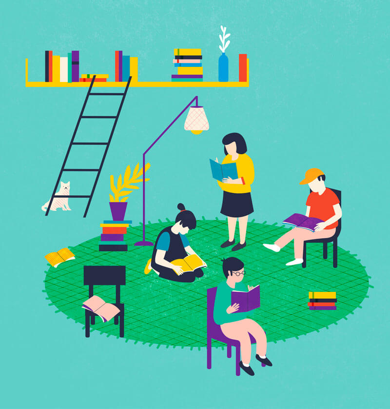
Yo Te Leo
Yo te leo means “I read you” in Spanish. The composition and poses of the characters are inspiring, and very natural.
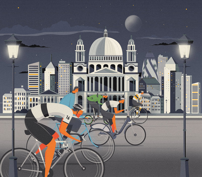
Mr Porter / Nocturne London
The movement of the wheels is nicely done. I also like the way the colors are applied on the cyclists, in combination with the cityscape the background.
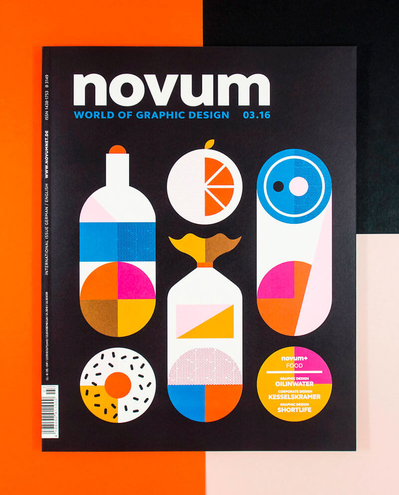
Novum 03.16
Beautiful cover illustration of graphic design magazine Novum. Clever usage of pure simple geometrical shapes and contrasting colors.
Miami 2017
Nice idea to draw the buildings of Miami and their colors. Love the overall concept.
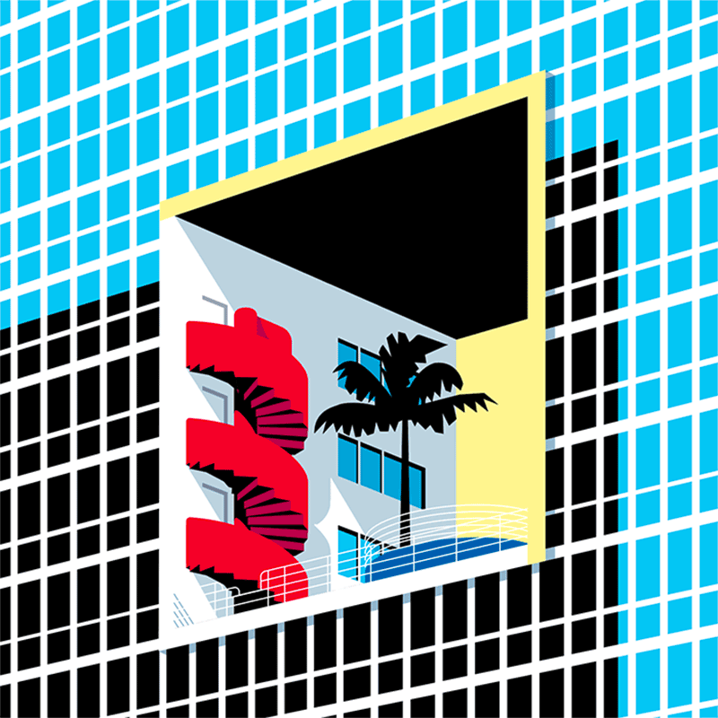
Miami 2017 II
A second one from the Miami series. Beautiful tones and composition, or should I say angle. If you take a closer look, you can almost feel the sun in this one.
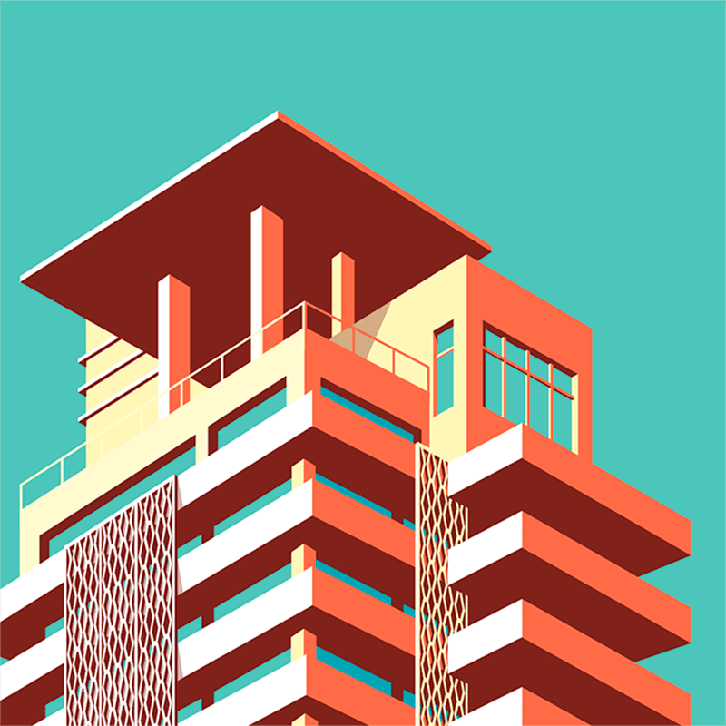
Para Revista Runners World
Admiring the textures and shadow usage. Plus the expression on his face is very well done.
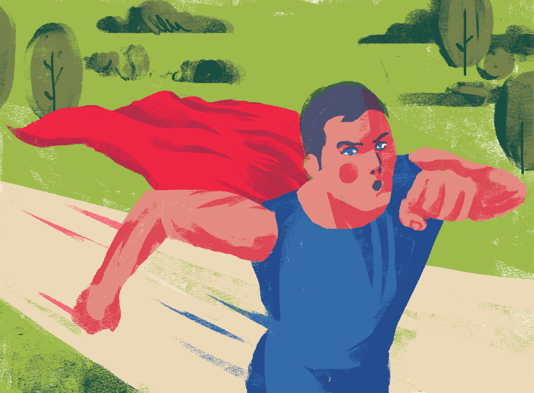
Fremont Street
That flame is ace! Lovely shapes, too.
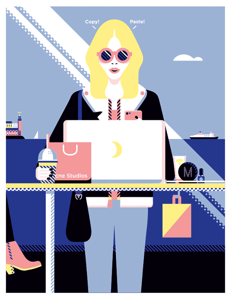
Anna Magazine
Illustration for an article on Swedish fashion bloggers that influence on current Scandinavian make-up trends. Interesting color palette.
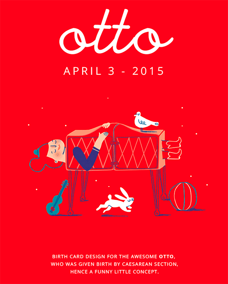
Otto
Lovely birth card that is part of a design that folds out. Be sure to see the inside.
Further Reading
- Finding Inspiration In The Little Things Around Us
- Spotify Playlists To Fuel Your Coding And Design Sessions
- How To Get Started With Sketchnotes
- Upcoming Web Design Conferences (June–October 2017)


