Front-End Performance 2021: Delivery Optimizations
This guide has been kindly supported by our friends at LogRocket, a service that combines frontend performance monitoring, session replay, and product analytics to help you build better customer experiences. LogRocket tracks key metrics, incl. DOM complete, time to first byte, first input delay, client CPU and memory usage. Get a free trial of LogRocket today.
Table Of Contents
- Getting Ready: Planning And Metrics
- Setting Realistic Goals
- Defining The Environment
- Assets Optimizations
- Build Optimizations
- Delivery Optimizations
- Networking, HTTP/2, HTTP/3
- Testing And Monitoring
- Quick Wins
- Everything on one page
- Download The Checklist (PDF, Apple Pages, MS Word)
- Subscribe to our email newsletter to not miss the next guides.
Delivery Optimizations
- Do we use
deferto load critical JavaScript asynchronously?
When the user requests a page, the browser fetches the HTML and constructs the DOM, then fetches the CSS and constructs the CSSOM, and then generates a rendering tree by matching the DOM and CSSOM. If any JavaScript needs to be resolved, the browser won’t start rendering the page until it’s resolved, thus delaying rendering. As developers, we have to explicitly tell the browser not to wait and to start rendering the page. The way to do this for scripts is with thedeferandasyncattributes in HTML.In practice, it turns out that it's better to use
deferinstead ofasync. Ah, what's the difference again? According to Steve Souders, onceasyncscripts arrive, they are executed immediately — as soon as the script is ready. If that happens very fast, for example when the script is in cache aleady, it can actually block HTML parser. Withdefer, browser doesn’t execute scripts until HTML is parsed. So, unless you need JavaScript to execute before start render, it’s better to usedefer. Also, multiple async files will execute in a non-deterministic order.It's worth noting that there are a few misconceptions about
asyncanddefer. Most importantly,asyncdoesn’t mean that the code will run whenever the script is ready; it means that it will run whenever the scripts is ready and all preceding sync work is done. In Harry Roberts' words, "If you put anasyncscript after sync scripts, yourasyncscript is only as fast as your slowest sync script."Also, it's not recommended to use both
asyncanddefer. Modern browsers support both, but whenever both attributes are used,asyncwill always win.If you'd like to dive into more details, Milica Mihajlija has written a very detailed guide on Building the DOM faster, going into the details of speculative parsing, async and defer.
- Lazy load expensive components with IntersectionObserver and priority hints.
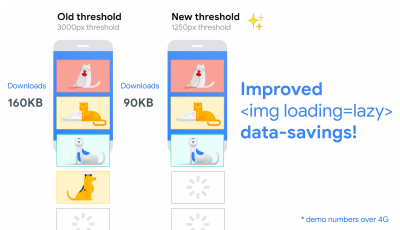
In general, it’s recommended to lazy-load all expensive components, such as heavy JavaScript, videos, iframes, widgets, and potentially images. Native lazy-loading is already available for images and iframes with theloadingattribute (only Chromium). Under the hood, this attribute defers the loading of the resource until it reaches a calculated distance from the viewport.<!-- Lazy loading for images, iframes, scripts. Probably for images outside of the viewport. --> <img loading="lazy" ... /> <iframe loading="lazy" ... /> <!-- Prompt an early download of an asset. For critical images, e.g. hero images. --> <img loading="eager" ... /> <iframe loading="eager" ... />That threshold depends on a few things, from the type of image resource being fetched to effective connection type. But experiments conducted using Chrome on Android suggest that on 4G, 97.5% of below-the-fold images that are lazy-loaded were fully loaded within 10ms of becoming visible, so it should be safe.
We can also use
importanceattribute (highorlow) on a<script>,<img>, or<link>element (Blink only). In fact, it’s a great way to deprioritize images in carousels, as well as re-prioritize scripts. However, sometimes we might need a bit more granular control.<!-- When the browser assigns "High" priority to an image, but we don’t actually want that. --> <img src="less-important-image.svg" fetchpriority="low" ... /> <!-- We want to initiate an early fetch for a resource, but also deprioritize it. --> <link rel="preload" fetchpriority="low" href="/script.js" as="script" />The most performant way to do slightly more sophisticated lazy loading is by using the Intersection Observer API that provides a way to asynchronously observe changes in the intersection of a target element with an ancestor element or with a top-level document’s viewport. Basically, you need to create a new
IntersectionObserverobject, which receives a callback function and a set of options. Then we add a target to observe.The callback function executes when the target becomes visible or invisible, so when it intercepts the viewport, you can start taking some actions before the element becomes visible. In fact, we have a granular control over when the observer’s callback should be invoked, with
rootMargin(margin around the root) andthreshold(a single number or an array of numbers which indicate at what percentage of the target’s visibility we are aiming).Alejandro Garcia Anglada has published a handy tutorial on how to actually implement it, Rahul Nanwani wrote a detailed post on lazy-loading foreground and background images, and Google Fundamentals provide a detailed tutorial on lazy loading images and video with Intersection Observer as well.
Remember art-directed storytelling long reads with moving and sticky objects? You can implement performant scrollytelling with Intersection Observer, too.
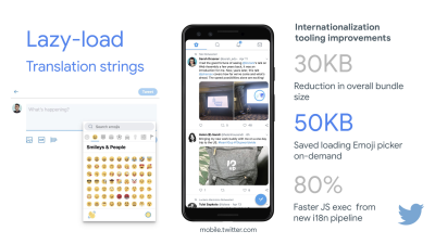
Check again what else you could lazy load. Even lazy-loading translation strings and emoji could help. By doing so, Mobile Twitter managed to achieve 80% faster JavaScript execution from the new internationalization pipeline.
A quick word of caution though: it’s worth noting that lazy loading should be an exception rather than the rule. It’s probably not reasonable to lazy-load anything that you actually want people to see quickly, e.g. product page images, hero images or a script required for the main navigation to become interactive.
- Load images progressively.
You could even take lazy loading to the next level by adding progressive image loading to your pages. Similarly to Facebook, Pinterest, Medium and Wolt, you could load low quality or even blurry images first, and then as the page continues to load, replace them with the full quality versions by using the BlurHash technique or LQIP (Low Quality Image Placeholders) technique.Opinions differ if these techniques improve user experience or not, but it definitely improves time to First Contentful Paint. We can even automate it by using SQIP that creates a low quality version of an image as an SVG placeholder, or Gradient Image Placeholders with CSS linear gradients.
These placeholders could be embedded within HTML as they naturally compress well with text compression methods. In his article, Dean Hume has described how this technique can be implemented using Intersection Observer.
Fallback? If the browser doesn’t support intersection observer, we can still lazy load a polyfill or load the images immediately. And there is even a library for it.
Want to go fancier? You could trace your images and use primitive shapes and edges to create a lightweight SVG placeholder, load it first, and then transition from the placeholder vector image to the (loaded) bitmap image.
- Do you defer rendering with
content-visibility?
For complex layout with plentiful of content blocks, images and videos, decoding data and rendering pixels might be a quite expensive operation — especially on low-end devices. Withcontent-visibility: auto, we can prompt the browser to skip the layout of the children while the container is outside of the viewport.For example, you might skip the rendering of the footer and late sections on the initial load:
footer {
  content-visibility: auto;
  contain-intrinsic-size: 1000px;
  /* 1000px is an estimated height for sections that are not rendered yet. */
}
Note that content-visibility: auto; behaves like overflow: hidden;, but you can fix it by applying
padding-leftandpadding-rightinstead of the defaultmargin-left: auto;,margin-right: auto;and a declared width. The padding basically allows elements to overflow the content-box and enter the padding-box without leaving the box model as a whole and getting cut off.Also, keep in mind that you might introduce some CLS when new content eventually gets rendered, so it’s a good idea to use
contain-intrinsic-sizewith a placeholder properly sized (thanks, Una!).Thijs Terluin has way more details about both properties and how
contain-intrinsic-sizeis calculated by the browser, Malte Ubl shows how you can calculate it and a brief video explainer by Jake and Surma explains how it all works.And if you need to get a bit more granular, with CSS Containment, you can manually skip layout, style and paint work for descendants of a DOM node if you need only size, alignment or computed styles on other elements — or the element is currently off-canvas.

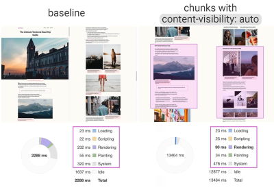
content-visibility: auto to chunked content areas gives a 7× rendering performance boost on initial load. (Large preview)- Do you defer decoding with
decoding="async"?
Sometimes content appears offscreen, yet we want to ensure that it’s available when customers need it — ideally, not blocking anything in the critical path, but decoding and rendering asynchronously. We can usedecoding="async"to give the browser a permission to decode the image off the main thread, avoiding user impact of the CPU-time used to decode the image (via Malte Ubl):<img decoding="async" … />Alternatively, for offscreen images, we can display a placeholder first, and when the image is within the viewport, using IntersectionObserver, trigger a network call for the image to be downloaded in background. Also, we can defer render until decode with img.decode() or download the image if the Image Decode API isn’t available.
When rendering the image, we can use fade-in animations, for example. Katie Hempenius and Addy Osmani share more insights in their talk Speed at Scale: Web Performance Tips and Tricks from the Trenches.
- Do you generate and serve critical CSS?
To ensure that browsers start rendering your page as quickly as possible, it’s become a common practice to collect all of the CSS required to start rendering the first visible portion of the page (known as "critical CSS" or "above-the-fold CSS") and include it inline in the<head>of the page, thus reducing roundtrips. Due to the limited size of packages exchanged during the slow start phase, your budget for critical CSS is around 14KB.If you go beyond that, the browser will need additional roundtrips to fetch more styles. CriticalCSS and Critical enable you to output critical CSS for every template you're using. In our experience though, no automatic system was ever better than manual collection of critical CSS for every template, and indeed that's the approach we've moved back to recently.
You can then inline critical CSS and lazy-load the rest with critters Webpack plugin. If possible, consider using the conditional inlining approach used by the Filament Group, or convert inline code to static assets on the fly.
If you currently load your full CSS asynchronously with libraries such as loadCSS, it’s not really necessary. With
media="print", you can trick browser into fetching the CSS asynchronously but applying to the screen environment once it loads. (thanks, Scott!)<!-- Via Scott Jehl. https://www.filamentgroup.com/lab/load-css-simpler/ --> <!-- Load CSS asynchronously, with low priority --> <link rel="stylesheet" href="full.css" media="print" onload="this.media='all'" />When collecting all the critical CSS for each template, it’s common to explore the "above-the-fold" area alone. However, for complex layouts, it might be a good idea to include the groundwork of the layout as well to avoid massive recalculation and repainting costs, hurting your Core Web Vitals score as a result.
What if a user gets a URL that’s linking directly to the middle of the page but the CSS hasn’t been downloaded yet? In that case, it has become common to hide non-critical content, e.g. with
opacity: 0;in inlined CSS andopacity: 1in full CSS file, and display it when CSS is available. It has a major downside though, as users on slow connections might never be able to read the content of the page. That’s why it’s better to always keep the content visible, even although it might not be styled properly.Putting critical CSS (and other important assets) in a separate file on the root domain has benefits, sometimes even more than inlining, due to caching. Chrome speculatively opens a second HTTP connection to the root domain when requesting the page, which removes the need for a TCP connection to fetch this CSS. That means that you could create a set of critical-CSS-files (e.g. critical-homepage.css, critical-product-page.css etc.) and serve them from your root, without having to inline them. (thanks, Philip!)
A word of caution: with HTTP/2, critical CSS could be stored in a separate CSS file and delivered via a server push without bloating the HTML. The catch is that server pushing was troublesome with many gotchas and race conditions across browsers. It was never supported consistently and had some caching issues (see slide 114 onwards of Hooman Beheshti’s presentation).
The effect could, in fact, be negative and bloat the network buffers, preventing genuine frames in the document from being delivered. So it wasn’t very surprising that for the time being, Chrome is planning to remove support for Server Push.
- Experiment with regrouping your CSS rules.
We’ve got used to critical CSS, but there are a few optimizations that could go beyond that. Harry Roberts conducted a remarkable research with quite surprising results. For example, it might be a good idea to split the main CSS file out into its individual media queries. That way, the browser will retrieve critical CSS with high priority, and everything else with low priority — completely off the critical path.Also, avoid placing
<link rel="stylesheet" />beforeasyncsnippets. If scripts don’t depend on stylesheets, consider placing blocking scripts above blocking styles. If they do, split that JavaScript in two and load it either side of your CSS.Scott Jehl solved another interesting problem by caching an inlined CSS file with a service worker, a common problem familiar if you’re using critical CSS. Basically, we add an ID attribute onto the
styleelement so that it’s easy to find it using JavaScript, then a small piece of JavaScript finds that CSS and uses the Cache API to store it in a local browser cache (with a content type oftext/css) for use on subsequent pages. To avoid inlining on subsequent pages and instead reference the cached assets externally, we then set a cookie on the first visit to a site. Voilà!It’s worth noting that dynamic styling can be expensive, too, but usually only in cases when you rely on hundreds of concurrently rendered composed components. So if you’re using CSS-in-JS, make sure that your CSS-in-JS library optimizes the execution when your CSS has no dependencies on theme or props, and don’t over-compose styled components. Aggelos Arvanitakis shares more insights into performance costs of CSS-in-JS.
- Do you stream responses?
Often forgotten and neglected, streams provide an interface for reading or writing asynchronous chunks of data, only a subset of which might be available in memory at any given time. Basically, they allow the page that made the original request to start working with the response as soon as the first chunk of data is available, and use parsers that are optimized for streaming to progressively display the content.We could create one stream from multiple sources. For example, instead of serving an empty UI shell and letting JavaScript populate it, you can let the service worker construct a stream where the shell comes from a cache, but the body comes from the network. As Jeff Posnick noted, if your web app is powered by a CMS that server-renders HTML by stitching together partial templates, that model translates directly into using streaming responses, with the templating logic replicated in the service worker instead of your server. Jake Archibald’s The Year of Web Streams article highlights how exactly you could build it. Performance boost is quite noticeable.
One important advantage of streaming the entire HTML response is that HTML rendered during the initial navigation request can take full advantage of the browser’s streaming HTML parser. Chunks of HTML that are inserted into a document after the page has loaded (as is common with content populated via JavaScript) can’t take advantage of this optimization.
Browser support? Still getting there with partial support in Chrome, Firefox, Safari and Edge supporting the API and Service Workers being supported in all modern browsers. And if you feel adventurous again, you can check an experimental implementation of streaming requests, which allows you to start sending the request while still generating the body. Available in Chrome 85.

- Consider making your components connection-aware.
Data can be expensive and with growing payload, we need to respect users who choose to opt into data savings while accessing our sites or apps. The Save-Data client hint request header allows us to customize the application and the payload to cost- and performance-constrained users.In fact, you could rewrite requests for high DPI images to low DPI images, remove web fonts, fancy parallax effects, preview thumbnails and infinite scroll, turn off video autoplay, server pushes, reduce the number of displayed items and downgrade image quality, or even change how you deliver markup. Tim Vereecke has published a very detailed article on data-s(h)aver strategies featuring many options for data saving.
Who is using
save-data, you might be wondering? 18% of global Android Chrome users have Lite Mode enabled (withSave-Dataon), and the number is likely to be higher. According to Simon Hearne’s research, the opt-in rate is highest on cheaper devices, but there are plenty of outliers. For example: users in Canada have an opt-in rate of over 34% (compared to ~7% in the US) and users on the latest Samsung flagship have an opt-in rate of almost 18% globally.With the
Save-Datamode on, Chrome Mobile will provide an optimized experience, i.e. a proxied web experience with deferred scripts, enforcedfont-display: swapand enforced lazy loading. It’s just more sensible to build the experience on your own rather than relying on the browser to make these optimizations.The header is currently supported only in Chromium, on the Android version of Chrome or via the Data Saver extension on a desktop device. Finally, you can also use the Network Information API to deliver costly JavaScript modules, high-resolution images and videos based on the network type. Network Information API and specifically
navigator.connection.effectiveTypeuseRTT,downlink,effectiveTypevalues (and a few others) to provide a representation of the connection and the data that users can handle.In this context, Max Böck speaks of connection-aware components and Addy Osmani speaks of adaptive module serving. For example, with React, we could write a component that renders differently for different connection types. As Max suggested, a
<Media />component in a news article might output:Offline: a placeholder withalttext,2G/save-datamode: a low-resolution image,3Gon non-Retina screen: a mid-resolution image,3Gon Retina screens: high-res Retina image,4G: an HD video.
Dean Hume provides a practical implementation of a similar logic using a service worker. For a video, we could display a video poster by default, and then display the "Play" icon as well as the video player shell, meta-data of the video etc. on better connections. As a fallback for non-supporting browsers, we could listen to
canplaythroughevent and usePromise.race()to timeout the source loading if thecanplaythroughevent doesn’t fire within 2 seconds.If you want to dive in a bit deeper, here are a couple of resources to get started:
- Addy Osmani shows how to implement adaptive serving in React.
- React Adaptive Loading Hooks & Utilities provides code snippets for React,
- Netanel Basel explores Connection-Aware Components in Angular,
- Theodore Vorilas shares how Serving Adaptive Components Using the Network Information API in Vue works.
- Umar Hansa show how to selectively download/execute expensive JavaScript.
- Consider making your components device memory-aware.
Network connection gives us only one perspective at the context of the user though. Going further, you could also dynamically adjust resources based on available device memory, with the Device Memory API.navigator.deviceMemoryreturns how much RAM the device has in gigabytes, rounded down to the nearest power of two. The API also features a Client Hints Header,Device-Memory, that reports the same value.Bonus: Umar Hansa shows how to defer expensive scripts with dynamic imports to change the experience based on device memory, network connectivity and hardware concurrency.
- Warm up the connection to speed up delivery.
Use resource hints to save time ondns-prefetch(which performs a DNS lookup in the background),preconnect(which asks the browser to start the connection handshake (DNS, TCP, TLS) in the background),prefetch(which asks the browser to request a resource) andpreload(which prefetches resources without executing them, among other things). Well supported in modern browsers, with support coming to Firefox soon.Remember
prerender? The resource hint used to prompt browser to build out the entire page in the background for next navigation. The implementations issues were quite problematic, ranging from a huge memory footprint and bandwidth usage to multiple registered analytics hits and ad impressions.Unsurprinsingly, it was deprecated, but the Chrome team has brought it back as NoState Prefetch mechanism. In fact, Chrome treats the
prerenderhint as a NoState Prefetch instead, so we can still use it today. As Katie Hempenius explains in that article, "like prerendering, NoState Prefetch fetches resources in advance; but unlike prerendering, it does not execute JavaScript or render any part of the page in advance."NoState Prefetch only uses ~45MiB of memory and subresources that are fetched will be fetched with an
IDLENet Priority. Since Chrome 69, NoState Prefetch adds the header Purpose: Prefetch to all requests in order to make them distinguishable from normal browsing.Also, watch out for prerendering alternatives and portals, a new effort toward privacy-conscious prerendering, which will provide the inset
previewof the content for seamless navigations.Using resource hints is probably the easiest way to boost performance, and it works well indeed. When to use what? As Addy Osmani has explained, it’s reasonable to preload resources that we know are very likely to be used on the current page and for future navigations across multiple navigation boundaries, e.g. Webpack bundles needed for pages the user hasn’t visited yet.
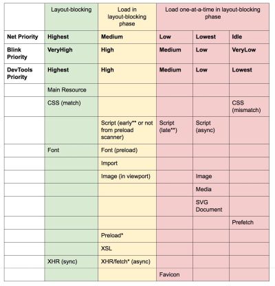
Addy’s article on "Loading Priorities in Chrome" shows how exactly Chrome interprets resource hints, so once you’ve decided which assets are critical for rendering, you can assign high priority to them. To see how your requests are prioritized, you can enable a "priority" column in the Chrome DevTools network request table (as well as Safari).
Most of the time these days, we’ll be using at least
preconnectanddns-prefetch, and we’ll be cautious with usingprefetch,preloadandprerender. Note that even withpreconnectanddns-prefetch, the browser has a limit on the number of hosts it will look up/connect to in parallel, so it’s a safe bet to order them based on priority (thanks Philip Tellis!).Since fonts usually are important assets on a page, sometimes it’s a good idea to request the browser to download critical fonts with
preload. However, double check if it actually helps performance as there is a puzzle of priorities when preloading fonts: aspreloadis seen as high importance, it can leapfrog even more critical resources like critical CSS. (thanks, Barry!)<!-- Loading two rendering-critical fonts, but not all their weights. --> <!-- crossorigin="anonymous" is required due to CORS. Without it, preloaded fonts will be ignored. https://github.com/w3c/preload/issues/32 via https://twitter.com/iamakulov/status/1275790151642423303 --> <link rel="preload" as="font" href="Elena-Regular.woff2" type="font/woff2" crossorigin="anonymous" media="only screen and (min-width: 48rem)" /> <link rel="preload" as="font" href="Mija-Bold.woff2" type="font/woff2" crossorigin="anonymous" media="only screen and (min-width: 48rem)" />Since
<link rel="preload">accepts amediaattribute, you could choose to selectively download resources based on@mediaquery rules, as shown above.Furthermore, we can use
imagesrcsetandimagesizesattributes to preload late-discovered hero images faster, or any images that are loaded via JavaScript, e.g. movie posters:<!-- Addy Osmani. https://addyosmani.com/blog/preload-hero-images/ --> <link rel="preload" as="image" href="poster.jpg" imagesrcset=" poster_400px.jpg 400w, poster_800px.jpg 800w, poster_1600px.jpg 1600w" imagesizes="50vw">We can also preload the JSON as fetch, so it’s discovered before JavaScript gets to request it:
<!-- Addy Osmani. https://addyosmani.com/blog/preload-hero-images/ -->
<link rel="preload" as="fetch" href="foo.com/api/movies.json" crossorigin>
We could also load JavaScript dynamically, effectively for lazy execution of the script.
/* Adding a preload hint to the head */
var preload = document.createElement("link");
link.href = "myscript.js";
link.rel = "preload";
link.as = "script";
document.head.appendChild(link);

/* Injecting a script when we want it to execute */
var script = document.createElement("script");
script.src = "myscript.js";
document.body.appendChild(script);
A few gotchas to keep in mind:
preloadis good for moving the start download time of an asset closer to the initial request, but preloaded assets land in the memory cache which is tied to the page making the request.preloadplays well with the HTTP cache: a network request is never sent if the item is already there in the HTTP cache.Hence, it’s useful for late-discovered resources, hero images loaded via
background-image, inlining critical CSS (or JavaScript) and pre-loading the rest of the CSS (or JavaScript).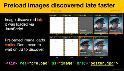
Preload important images early; no need to wait on JavaScript to discover them. (Image credit: “Preload Late-Discovered Hero Images Faster” by Addy Osmani) (Large preview) A
preloadtag can initiate a preload only after the browser has received the HTML from the server and the lookahead parser has found thepreloadtag. Preloading via the HTTP header could be a bit faster since we don’t to wait for the browser to parse the HTML to start the request (it’s debated though).Early Hints will help even further, enabling preload to kick in even before the response headers for the HTML are sent (on the roadmap in Chromium, Firefox). Plus, Priority Hints will help us indicate loading priorities for scripts.
Beware: if you’re using
preload,asmust be defined or nothing loads, plus preloaded fonts without thecrossoriginattribute will double fetch. If you’re usingprefetch, beware of theAgeheader issues in Firefox.
- Use service workers for caching and network fallbacks.
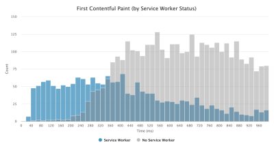
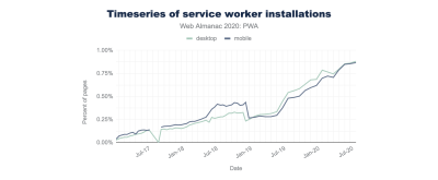
No performance optimization over a network can be faster than a locally stored cache on a user’s machine (there are exceptions though). If your website is running over HTTPS, we can cache static assets in a service worker cache and store offline fallbacks (or even offline pages) and retrieve them from the user’s machine, rather than going to the network.As suggested by Phil Walton, with service workers, we can send smaller HTML payloads by programmatically generating our responses. A service worker can request just the bare minimum of data it needs from the server (e.g. an HTML content partial, a Markdown file, JSON data, etc.), and then it can programmatically transform that data into a full HTML document. So once a user visits a site and the service worker is installed, the user will never request a full HTML page again. The performance impact can be quite impressive.
Browser support? Service workers are widely supported and the fallback is the network anyway. Does it help boost performance? Oh yes, it does. And it’s getting better, e.g. with Background Fetch allowing background uploads/downloads via a service worker as well.
There are a number of use cases for a service worker. For example, you could implement "Save for offline" feature, handle broken images, introduce messaging between tabs or provide different caching strategies based on request types. In general, a common reliable strategy is to store the app shell in the service worker’s cache along with a few critical pages, such as offline page, frontpage and anything else that might be important in your case.
There are a few gotchas to keep in mind though. With a service worker in place, we need to beware range requests in Safari (if you are using Workbox for a service worker it has a range request module). If you ever stumbled upon
DOMException: Quota exceeded.error in the browser console, then look into Gerardo’s article When 7KB equals 7MB.As Gerardo writes, “If you are building a progressive web app and are experiencing bloated cache storage when your service worker caches static assets served from CDNs, make sure the proper CORS response header exists for cross-origin resources, you do not cache opaque responses with your service worker unintentionally, you opt-in cross-origin image assets into CORS mode by adding the
crossoriginattribute to the<img>tag.”There is plenty of great resources to get started with service workers:
- Service Worker Mindset, which helps you understand how service workers work behind the scenes and things to understand when building one.
- Chris Ferdinandi provides a great series of articles on service workers, explaining how to create offline applications and covering a variety of scenarios, from saving recently viewed pages offline to setting an expiration date for items in a service worker cache.
- Service Worker Pitfalls and Best Practices, with a few tips about the scope, delaying registering a service worker and service worker caching.
- Great series by Ire Aderinokun on "Offline First" with Service Worker, with a strategy on precaching the app shell.
- Service Worker: An Introduction with practical tips on how to use service worker for rich offline experiences, periodic background syncs and push notifications.
- It's always worth referring to good ol' Jake Archibald’s Offline Cookbook with a number of recipes on how to bake your own service worker.
- Workbox is a set of service worker libraries built specifically for building progressive web apps.
- Are you running servers workers on the CDN/Edge, e.g. for A/B testing?
At this point, we are quite used to running service workers on the client, but with CDNs implementing them on the server, we could use them to tweak performance on the edge as well.For example, in A/B tests, when HTML needs to vary its content for different users, we could use Service Workers on the CDN servers to handle the logic. We could also stream HTML rewriting to speed up sites that use Google Fonts.
- Optimize rendering performance.
Whenever the application is sluggish, it's noticeable right away. So we need to make sure that there is no lag when scrolling the page or when an element is animated, and that you’re consistently hitting 60 frames per second. If that’s not possible, then at least making the frames per second consistent is preferable to a mixed range of 60 to 15. Use CSS’will-changeto inform the browser of which elements and properties will change.Whenever you are experiencing, debug unnecessary repaints in DevTools:
- Measure runtime rendering performance. Check some useful tips on how to make sense of it.
- To get started, check Paul Lewis’ free Udacity course on browser-rendering optimization and Georgy Marchuk’s article on Browser painting and considerations for web performance.
- Enable Paint Flashing in "More tools → Rendering → Paint Flashing" in Firefox DevTools.
- In React DevTools, check "Highlight updates" and enable "Record why each component rendered",
- You can also use Why Did You Render, so when a component is re-rendered, a flash will notify you of the change.
Are you using a Masonry layout? Keep in mind that might be able to build a Masonry layout with CSS grid alone, very soon.
If you want to dive deeper into the topic, Nolan Lawson has shared tricks to accurately measure layout performance in his article, and Jason Miller suggested alternative techniques, too. We also have a lil' article by Sergey Chikuyonok on how to get GPU animation right.

Browsers can animate transform and opacity cheaply. CSS Triggers is useful for checking if CSS triggers re-layouts or reflows. (Image credit: Addy Osmani)(Large preview) Note: changes to GPU-composited layers are the least expensive, so if you can get away by triggering only compositing via
opacityandtransform, you’ll be on the right track. Anna Migas has provided a lot of practical advice in her talk on Debugging UI Rendering Performance, too. And to understand how to debug paint performance in DevTools, check Umar’s Paint Performance audit video. - Have you optimized for perceived performance?
While the sequence of how components appear on the page, and the strategy of how we serve assets to the browser matter, we shouldn’t underestimate the role of perceived performance, too. The concept deals with psychological aspects of waiting, basically keeping customers busy or engaged while something else is happening. That’s where perception management, preemptive start, early completion and tolerance management come into play.What does it all mean? While loading assets, we can try to always be one step ahead of the customer, so the experience feels swift while there is quite a lot happening in the background. To keep the customer engaged, we can test skeleton screens (implementation demo) instead of loading indicators, add transitions/animations and basically cheat the UX when there is nothing more to optimize.
In their case study on The Art of UI Skeletons, Kumar McMillan shares some ideas and techniques on how to simulate dynamic lists, text, and the final screen, as well as how to consider skeleton-thinking with React.
Beware though: skeleton screens should be tested before deploying as some tests showed that skeleton screens can perform the worst by all metrics.
- Do you prevent layout shifts and repaints?
In the realm of perceived performance probably one of the more disruptive experiences is layout shifting, or reflows, caused by rescaled images and videos, web fonts, injected ads or late-discovered scripts that populate components with actual content. As a result, a customer might start reading an article just to be interrupted by a layout jump above the reading area. The experience is often abrupt and quite disorienting: and that’s probably a case of loading priorities that need to be reconsidered.The community has developed a couple of techniques and workarounds to avoid reflows. In general, it’s a good idea to avoid inserting new content above existing content, unless it happens in response to a user interaction. Always set width and height attributes on images, so modern browsers allocate the box and reserve the space by default (Firefox, Chrome).
For both images or videos, we can use an SVG placeholder to reserve the display box in which the media will appear in. That means that the area will be reserved properly when you need to maintain its aspect ratio as well. We can also use placeholders, or fallback images for ads and dynamic content, as well as pre-allocate layout slots.
Instead of lazy-loading images with external scripts, consider using native lazy-loading, or hybrid lazy-loading when we load an external script only if native lazy-loading isn’t supported.
As mentioned above, always group web font repaints and transition from all fallback fonts to all web fonts at once — just make sure that that switch isn’t too abrupt, by adjusting line-height and spacing between the fonts with font-style-matcher.
To override font metrics for a fallback font to emulate a web font, we can use @font-face descriptors to override font metrics (demo, enabled in Chrome 87). (Note that adjustments are complicated with complicated font stacks though.)
For late CSS, we can ensure that layout-critical CSS is inlined in the header of each template. Even further than that: for long pages, when the vertical scrollbar is added, it does shift the main content 16px to the left. To display a scrollbar early, we can add
overflow-y: scrollonhtmlto enforce a scrollbar at first paint. The latter helps because scrollbars can cause non-trivial layout shifts due to above the fold content reflowing when width changes. Should mostly happen on platforms with non-overlay scrollbars like Windows though. But: breaksposition: stickybecause those elements will never scroll out of the container.If you deal with headers that become fixed or sticky positioned to the top of the page on scroll, reserve space for the header when it becomes pineed, e.g. with a placeholder element or
margin-topon the content. An exception should be cookie consent banners that shouldn’t have impact on CLS, but sometimes they do: it depends on the implementation. There are a few interesting strategies and takeaways in this Twitter thread.For a tab component that might include various amount of texts, you can prevent layout shifts with CSS grid stacks. By placing the content of each tab in the same grid area, and hiding one of them at a time, we can ensure that the container always takes the height of the larger element, so no layout shifts will occur.
Ah, and of course, infinite scrolling and "Load more" can cause layout shifts as well if there is content below the list (e.g. footer). To improve CLS, reserve enough space for content that would be loaded in before the user scrolls to that part of the page, remove the footer or any DOM elements at the bottom of the page that may be pushed down by content loading in. Also, prefetch data and images for below-the-fold content so that by the time a user scrolls that far, it’s already there. You can use list virtualization libraries like react-window to optimize long lists as well (thanks, Addy Osmani!).
To ensure that the impact of reflows is contained, measure the layout stability with the Layout Instability API. With it, you can calculate the Cumulative Layout Shift (CLS) score and include it as a requirement in your tests, so whenever a regression appears, you can track it and fix it.
To calculate the layout shift score, the browser looks at the viewport size and the movement of unstable elements in the viewport between two rendered frames. Ideally, the score would be close to
0. There is a great guide by Milica Mihajlija and Philip Walton on what CLS is and how to measure it. It’s a good starting point to measure and maintain perceived performance and avoid disruption, especially for business-critical tasks.Quick tip: to discover what caused a layout shift in DevTools, you can explore layout shifts under "Experience" in the Performance Panel.
Bonus: if you want to reduce reflows and repaints, check Charis Theodoulou’s guide to Minimising DOM Reflow/Layout Thrashing and Paul Irish’s list of What forces layout / reflow as well as CSSTriggers.com, a reference table on CSS properties that trigger layout, paint and compositing.
Table Of Contents
- Getting Ready: Planning And Metrics
- Setting Realistic Goals
- Defining The Environment
- Assets Optimizations
- Build Optimizations
- Delivery Optimizations
- Networking, HTTP/2, HTTP/3
- Testing And Monitoring
- Quick Wins
- Everything on one page
- Download The Checklist (PDF, Apple Pages, MS Word)
- Subscribe to our email newsletter to not miss the next guides.

